
branding design: the flourishing five brand extension

branding design: the brand extension
I got to put my brand extension package to work with The Flourishing Five! Hannah at Always Flourishing Photography wanted to create branding for her annual 5 day sales event that still flowed with her current branding. The brand extension is all about ADDING to your current brand. Sometimes your brand starts to feel tired, misaligned from the direction you are currently moving, or in Hannah’s case, needs to expand for a new offer.
about hannah
Hannah is a Central Illinois brand photographer all about helping you feel confident with photos that truly reflect your brand. She truly works some special kind of magic. The immediate way my audience perceived me as an expert and my brand more accurately after a brand shoot with Hannah is actually insane. She is so kind and caring and one of the coolest girlies on the block. She loves the color pink and a good thrifting trip. She is so fun to know and follow. If brand photography is next on your business investment list, she is it.
brand voice
Hannah’s voice is down-to-earth, caring, and conversational. For The Flourishing Five, I wanted to capture her voice as high-end but down-to-earth. Chill and conversational and personal WHILE also owning how valuable what Hannah creates really is.
the visual vibes
Hannah already had an established brand created by another designer. It is beautiful and Hannah really loved how it felt for her business. I wanted to honor that and what she has already created, while aligning it with the flourishing five, adding in even more personality, and really being intentional and meaningful while representing all that the Always Flourishing brand stands for. The vibes are girly, confident, thoughtful, fun, but still boss moves.


The pinks and purple are from her original branding color palette. The yellow subconsciously communicates confidence, the blue conveys a feeling of peace and calm that comes with The Flourishing Five offers, and the brown adds contrast and makes us feel grounded. I used a combination of Hannah’s brand photos and images from our Pinterest inspiration board to craft a moodboard that felt like the direction we were moving.
Once the moodboard was approved by Hannah, I got to sketching.
Brainstorming & Sketching
It all begins pretty rough. Spending a lot of time in this stage makes for a really strong, unique brand. It’s messy and tends not to be shown with the buttoned up pieces of a brand, but I love showing the humble beginnings. What is life, if not messy?
concept delivery
Before finalizing all of her files and brand guidelines, I shared my concept with Hannah! I sent a video talking through her brand guidelines and the thought process behind what I had created.
With Hannah’s final approval, I went on to offload her files in all the colors and file types which you can see below!
THE FINAL BRAND

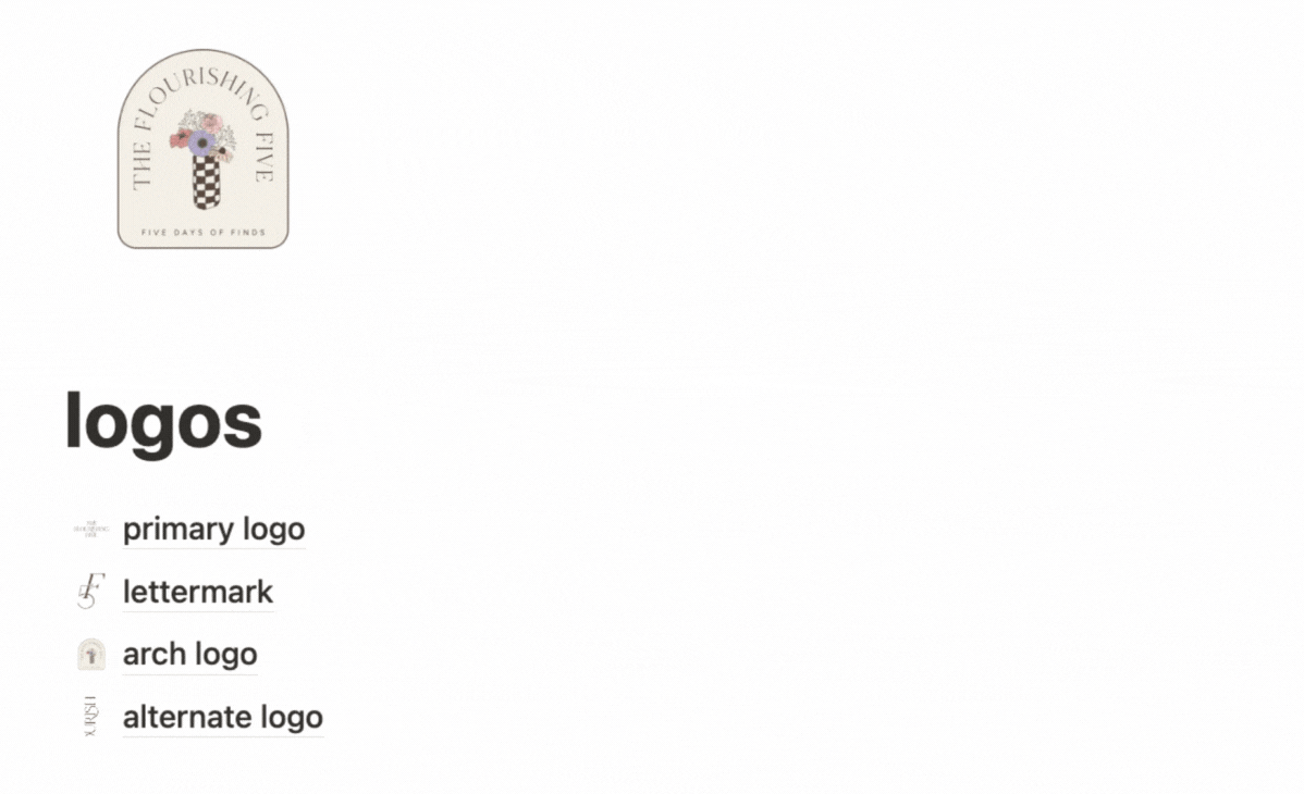
primary logo
I wanted the primary logo to be simple, but with details that speak volumes. We stuck with the main typeface from her existing brand so that flowed. The curved bars (the middle line) on the f’s and e’s feel flowy and bring some movement. The type is center aligned to communicate the balance that comes with her offers.

lettermark
The lettermark can really be one of my favorite logo versions. For Hannah’s, I designed it and felt like it needed a more authentic touch, so I hand traced it then re-vectorized it. It gave it texture and the personal touch that Hannah adds to all of her work. The F and 5 are intertwined to communicate the idea that the 5 offers will help you flourish.

submark
This logo version is image AND type based. The vase of flowers felt like one of the most pivotal elements I’d created. Hannah loves an arch, so I liked including that here. It feels kind of like a badge to me.

alternate logo
The alternate logo is meant to fit in spaces that the other logo options cannot. In this case, it is long ways!
logo suite
Your logo suite NEEDS to be responsive. It has to include several versions to fit in different conditions. Hannah added on a logo suite to her brand extension which gave her all of those options instead of a single, static logo. There are times where one logo is the perfect addition to what already exists. Since these were all of the logos for The Flourishing Five, an entire added suite will serve her best.
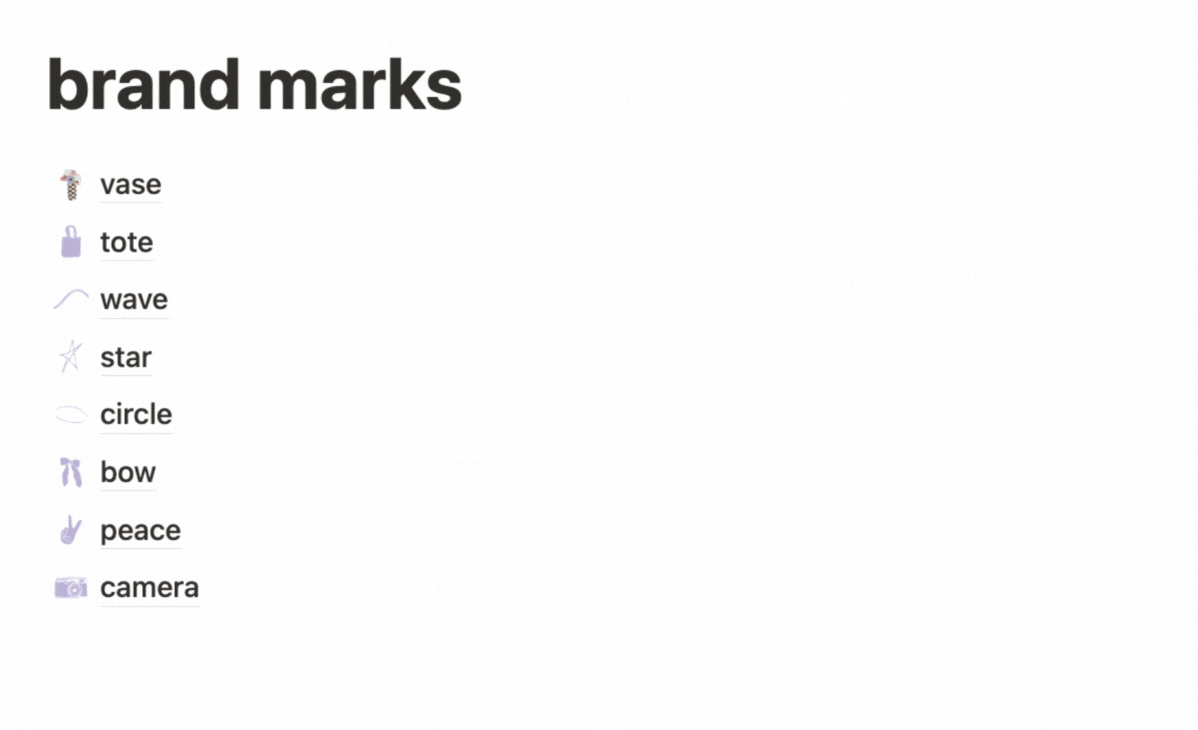
brand elements
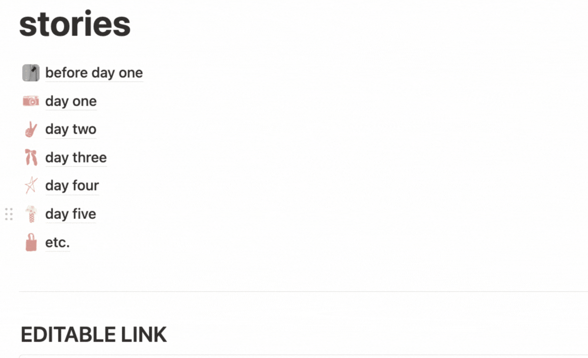
I just LOVE creating brand elements. The brainstorming process of how to visualize what a brand stands for with icons is exciting to me. It makes me think in new ways. Hannah loves thrifting, so I added that idea into the messaging we created. I created a little tote for the “finds”. The peace sign, the camera, the bows, the flowers, they all just FEEL like Hannah and The Flourishing Five. I put a lot of thought into the flower vase, tracing the vase from one that Hannah owned. Each flower symbolized an aspect of the brand, one I even drew based on a flower from Hannah’s garden.


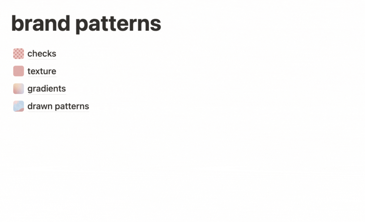
brand patterns
I loveeee creating custom patterns for the brands I create. You can use them as backgrounds of graphics or stories. They can be used in packaging, add texture to presentations or PDFs, and just add a level of depth to a brand.
Hannah’s included hand drawn abstract textures, gradients, checker in every possible color combo, and some line drawings.
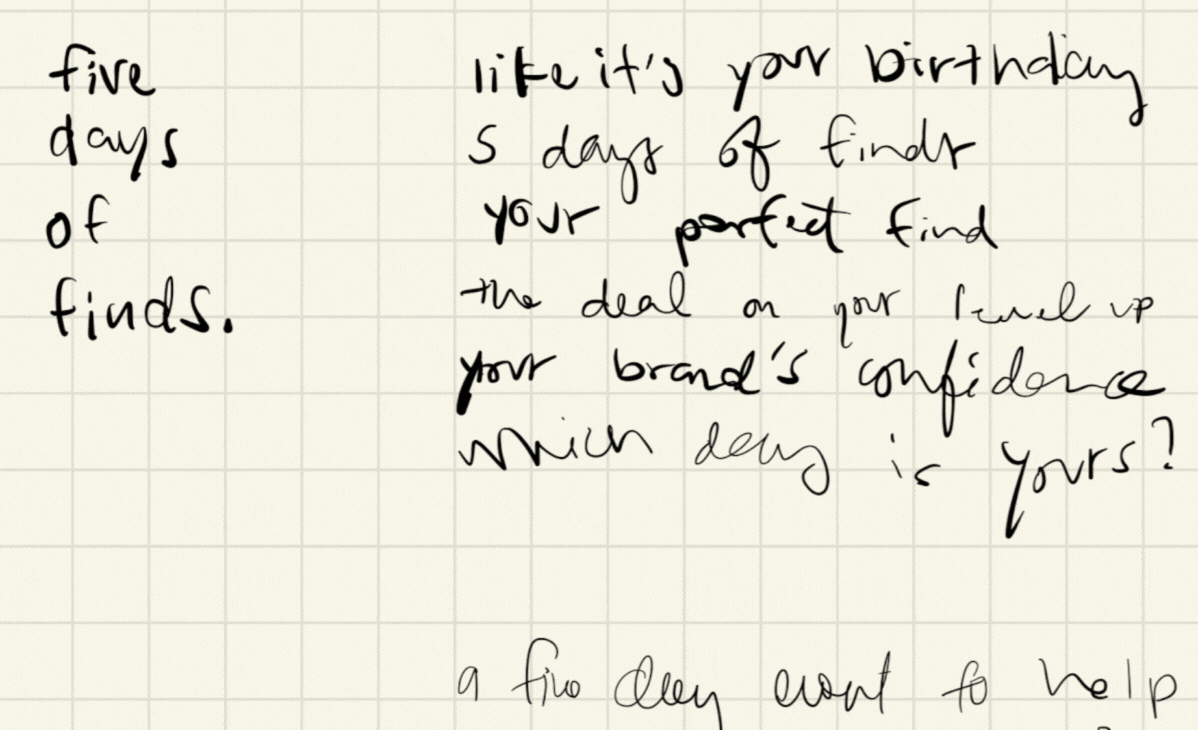
The Taglines
A brand is made up of words just as much as anything else.
Taglines are easily repeatable phrases that effectively communicate your brand without being a million pages long. Each day of The Flourishing Five got a tagline to go along with it that makes people feel.
I love giving my brands options for taglines that really communicate on a visceral level. Brand voice is SUPER important to my projects. Branding and marketing can feel really cold. A brand voice is a way to humanize the brand. Sometimes it feels as though brands are forced through this professional filter—like someone vacuum sealed the life out of them (too much stuff, not enough space??? is that you???). I like to think I do the opposite of that.
a peek at hannah’s final file hub:

unlock your brand’s design
Your brand is as unique as you are. It has a soul, but chances are outsiders aren’t seeing it. You may understand it, but no one else does. Brand design in my world is all about illustrating your brand’s soul, your unique magic, and showing your genuine offer of value. Because we aren’t tricking people into giving us money. We are giving them a transformation, a new version of themselves, it’s an exchange of value that words may never be able to describe how wonderful and important it truly is. So, click the button and let’s unlock yours.